 |
Do you need a custom version of TT Hoves?
Useful links:
TT Hoves PDF Type Specimen
TT Hoves graphic presentation at Behance
TT Hoves completes the TypeType font trilogy dedicated to modern sans serif. The first was TT Norms—the universal geometric sans for the widest possible range of tasks. The second was the neutral sans TT Commons, which was originally designed as a corporate typeface for TypeType studios.
Unlike the first two typefaces included in the trilogy, TT Hoves has a distinct character, but without too bright bursts or kinks—it’s not too neutral and is moderately bright. We wanted to create a sans serif with recognizable patterns and geometry that would be perfectly suited for solving visual problems in such areas as architecture, design, industry, science, astronomy, drawing, high tech, research, space, statistics.
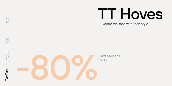
The typeface name TT Hoves comes from an abbreviated combination of two words: horizontals + verticals (ho + ve), which is intended to emphasize the fact that vertical and horizontal strokes predominate in the design of the typeface. Other distinctive features of the TT Hoves design are sharp turns in letters like f t J r j and the shape of the internal junctions of diagonal 2-point strokes (A W M N V X), which is intended to add a square and technologically advanced touch to the picture. The stroke thickness tends to a single width for the entire range of styles, with natural compensations in the boldest styles.
The TT Hoves font family consists of 20 fonts: 10 weights (from Hairline to Black) and 10 corresponding italics. Each of the styles includes 1348 glyphs. TT Hoves covers almost all languages using the Latin alphabet, as well as most languages using Cyrillic. In addition, in TT Hoves you can find a small capitals for Latin and Cyrillic and a large number of ligatures and stylistic alternates. In order to make it more convenient for you to use stylistic alternates, we have divided them into separate stylistic sets, one letter per set.
We also did not forget about the mathematical and navigation signs, drew currency signs and added all types of numbers. A complete list of useful OpenType features that you can find in TT Hoves: zero, frac, ordn, case, c2sc, smcp, ccmp, locl, sinf, sups, numr, dnom, tnum, onum, lnum, pnum, dlig, liga, calt, salt, ss01, ss02, ss03, ss04, ss05, ss06, ss07, ss08, ss09, ss10, ss11, ss12, ss13, ss14, ss15, ss16, ss17. Separately, we would like to draw your attention to high-quality and detailed hinting, which is designed to help the typeface work well in a small size and even on small screens.